Why Online Marketing Is the Only Place You Should Be Spending Your Marketing Budget

We say this constantly – online marketing is the only place you should be spending your hard earned money.

With the huge advances made in the internet age, the world wide web has completely changed the face of marketing – and with it, the way a customer is sold to. No longer is flashing a product & telling them about it enough to run a successful business.

With the amount of choices & variables available for every kind of product & service in today’s competitive market, it takes fostering a relationship & real time communication to really get a customer.

This is where one of the benefits of digital marketing comes in. Unlike old school methods of marketing, digital marketing opens up a two-way communication.

For example, social media marketing allows customers to interact and engage with your brand and really get to know you on a personal level – and this is where they make the decision to come to you (versus your competitors) to fulfil their need.

But that’s not the only reason online marketing beats old school methods. These 5 points make it a clear winner when it comes to choosing your prime channel of marketing:

Unlimited reach options

Where you want to target people locally or globally, you can reach people specifically the way you want to.  You can widen your reach to expand your audience & increase awareness.. You can also target people who would actually be interested in what you have to offer, instead of blindly advertising to those who have no interest in your product or service.

Lets you track results

With online marketing you can track all the conversions & customers you are getting and from where exactly they are coming.  There is no guessing game – you know exactly how many people saw your ad, how many clicked and how many converted. Compare this with a method like print advertising, where there is no way to tell how many actually saw your ad & you’ll see the benefit. It makes it easier to optimise your budget & spend only on sources that are working for you.

Budget friendly

You can reach as many as 1000 people for just a few cents. That itself is pretty amazing. However, with the amount of options available to optimise and target your ads, you can really get astounding returns for a fraction of the cost. Online marketing is by far one of the most cost effective methods of promotion.

No guess work

You know exactly where your money is going and it’s super easy to calculate your ROI – unlike old school methods where you would guess or have an approximation of how many clients/revenue was made out of a particular print campaign. With online marketing, you stay clear about your numbers and figures when calculating the end result.

Builds a database

When you do online marketing, it becomes easier to gather a database of people interested in your services. This helps you reach out to them again and convert a customer that didn’t buy from you the first time they saw your ad. When you run a print ad, it’s impossible to get any details for further communication with them. They see your ad, and they either buy or don’t – that’s it. However, with online marketing, every cent you pay gives you a return. Even a customer that didn’t buy from you but clicked on your ad is tracked, which means you can pixel them and market to them again.

If you haven’t already, it’s time to put some serious thought into online marketing – it’s a channel that can very easily generate a 100% ROI, and much more!

Trying to figure out the best channel for your online marketing?

Book a free strategy session where we look at your business and your digital presence to determine the best platform to generate new customers online.

Request a session now

Create Your Buyer Persona Using These Guides

Have you ever wondered why some businesses thrive so well while many keep struggling at the base level? Well, it’s all because of the difference in marketing approach.

Marketing isn’t based on luck factor; it’s all in the strategy. If you wish to get the best return on your marketing spend, you ought to know who your customer is. In marketing, this is termed as―buyer persona.

What is a buyer persona?

A buyer persona allows you to humanise your segment of potential customers. It can be a vital step when setting up a marketing plan that actually works, as it allows you to really distinguish who your target audience is and what they will actually respond to. Using buyer personas, you get to know what your customers priorities are, what exactly motivates them and what will make them choose you over your competitors.

Unlike general demographical plans that are limited to factors such as age, city, income level etc, buy persona’s dig deeper into customers thoughts and emotions.

How does it boost your marketing?

1. It helps you convey a stronger message as you know what your customer needs are, you get your brand message tailor made.

2. It aids in minimizing the advertising waste as you get to design targeted ads.

3. It helps you discover objections.

Setting up your buyer persona

These 5 steps are good starting points when setting up a buyer persona for your customer profile:

Get personal: Get to know your customers on a personal level. Asking questions as what they like or what they do help you get more personal and relevant information. You can ask about their background, daily activities, goals and aspirations, problems, way to reach them etc. Get details that will be helpful in creating the buyer persona as suiting your business.

Do some social research: Browse through some social networking sites, forums and other social platforms to know what the customer looks for or what he is more interested in.

Create a preface customer profile: Look at your primary customer data and collect general characteristics relating to your business. It could be any relevant information as gender, age, education level, marital status, or any other.

Ask questions and promote feedback: Interaction with customers is one great way of knowing what their thoughts are, what problems are they facing and what seeks their interest the most. This could be done by creating questionnaire. SurveyMonkey, SurveyMoz and FluidSurveys are some of the free online survey and questionnaire services. Here you even get to target the non-customers which apparently increase your chances of getting more of potential leads.

Analyze and act: With the help of buyer persona, your marketing strategy will be able to target specific problems as experienced by your customers. Get to know what issues they may be experiencing and design ways to deal with them.

Creating buyer personas is not an end result, it’s a process. It should be frequently evaluated to make sure you stay on top of varying trends and demographics.

7 Key Elements Every Homepage Must Have To Make Visitors Take Action

Hurray! You’ve taken the first step and you can proudly say that your business has a website – but are you sure your website is actually helping you?

What we mean is.. Does it produce results? Is it helping you drive more users to take actions? Is it adding to your bottom line by generating you more customers?

If your answer is a maybe or a no, then your website isn’t utilising its full power. It’s just acting as a decorative hanger for your business at the moment.. when it can act as your most powerful sales machine.

Your website is one of the most important foundations – it’s how people find you and learn more about your brands, products & services. It’s also where over 80% of people make their buying decision.

So how do you know if your business website is working effectively? There are a multitude of ways to test how conversion friendly your website is, and what kind of returns it brings from the amount of traffic you send to it.

But before getting into that, the first step is simply starting with a good first impression – your homepage design.

Sure, it needs to look good & be visually appealing – however, when designing a homepage that can successfully hook visitors, there are a number of aspects to take into consideration when creating this design. While it should remain visually appealing, it also needs to be functional & strategic.

So what points should you analyse on your homepage design?

Tick off the 7 points below to ensure you have the most basic foundation laid out right – these will help you know that you have at least started off on the right foot.

Easily found information

We see a lot of websites that have really snazzy graphics – funky layouts, creative designing – but fail to make it absolutely apparent what the website is about. If a visitor lands on your homepage and can’t understand what you do or what you offer in the first 5 seconds, there’s a very high chance you’ve lost their business.

Your homepage must be able to answer clearly ‘Who you are’, ‘what you do’, and ‘what the customer can do on your site’. Don’t make your visitor think and probe too much – if they can’t identify what you’re all about as soon as they land on your page, they won’t stay on for too long.

Talk in the language of your people

Every business has a target audience – so is your homepage targeting the right audience. Are you using the language that will hook your niche? Is your design consistent with what your demographic will find trendy and appealing?

It’s also important to steer clear of any text that is hard to comprehend – using technical jargon is an absolute no-no. Your target customer should identify with your homepage immediately in order to form a connection & also understand how your service matches their needs.

Show what makes you special

Let’s call it value proposition – in order to do well, you have to have a unique selling point. Either your product is superior in quality, or more economical.. perhaps you offer free shipping. Whatever extra value you provide your potential customer should be evident on your homepage. Don’t wait for them to browse around & find out about that extra value by stumbling upon it – you need to flash that value in their face to show them why you are the one they have been looking for.

Device friendly

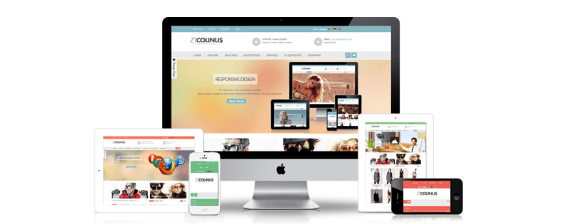
If you’ve made your website recently, it’s probably already responsive. I.e: it is compatible across all devices and browsers. However, if your website was made a while ago you might need to responsive functionality. And it’s recommended to do this at the earliest, as more than 50% of users are now browsing using a smart device instead of a traditional desktop.

It should be easy to navigate, and there shouldn’t be any “flashy” object interrupting user browsing experience like flash banners, pop-ups, animations or overly-fancy and pointless elements.

Tell them to take action

When someone lands on your homepage, you shouldn’t assume that they are going to take the initiative to dig deeper and browse through your services. You need to tell them to do it! Your homepage should have strategically placed call to actions that direct users to sales pages or pages where they are required to take the desired step. Without the right kind of CTA, you lose out on the potential of turning a visitor into an actual reachable lead.

Call to actions can be anything from “Subscribe Now” to “Call to Book” – however, CTA’s on a homepage are more based on controlling a visitors navigation process and directing them to exactly where you want them to go – you would first want to instruct them to find out more, before selling them or asking them to give you something (like their email address, their time, or their money!)

Be ready for change

Some homepage designs are so intricate that there is no room for change – which can be a bad thing. Successful websites that generate tons of leads are usually continuously optimised & tweaked according to user behaviour. Try keeping your homepage design flexible so it can make room for changes & future optimisation.

Look good – because, let’s face it.. We all judge that book by it’s cover!

Finally, once you have accounted for the functionality of your website you need to ensure it looks good.  Good design pleases people, and also influences their perception of your brand. And make sure your design is consistent. While you may have call to actions, are they placed properly? Do they look good or just look like an eye-sore that the visitor would get irritated by? These are all very important questions that determine whether your visitor will want to keep interacting with you. I mean personally, I would steer clear of a website if it looked really bad – it’s just such a turn off, don’t you agree?

Still not sure your website is set up right?

Have a free consultation with our lead generation expert to check your website & get pointers on what can be improved to increase sales & conversions.

Request an appointment now

Case Study: How Pathway Visa’s Got 5000+ Leads Every Month

Have you ever wondered why successful businesses vouch for social media marketing? The answer is very simple―it brings the desired results.

A well designed Facebook ad campaign can help you sky rocket your daily leads, and when followed through properly, this can create a substantial following of loyal customers.

To support this, let’s share with you Pathway Visa’s Facebook ad campaigns, who received over 5,000 leads every month. That’s about 166 leads a day (we’re down sizing it a bit – as you’ll see below, they actually touch quite more than just 166 leads a day)

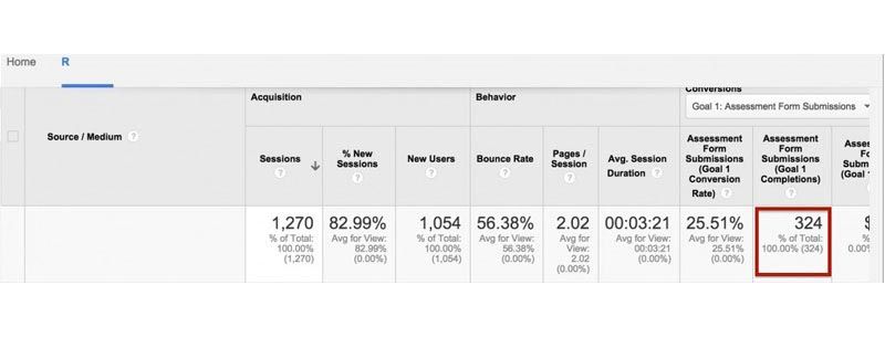
With an initial requirement of 100 leads per day with their allocated budget, their main type of lead was a submission on their Request a Free Assessment form.

So how did we go about meeting, and exceeding, this goal?

Our first step was to make a number of strategic changes on their website & their landing pages. We also changed the title of their lead form in order to incentivise more people to actually fill it, and added a few additional call to actions to further increase the conversion of visitors sent through Facebook.

Due to the changes made above, the results achieved were far superior to the basic requirements – instead of 100 leads a day, they were receiving an average of 250 leads every day.

They even touched 350 leads on certain days – and all for the same budget allocated for 100 form submissions.

So how can you create such magic with your Facebook Advertising?

The key is where you are sending your traffic to, not how you are sending them.

Apart from analysing your campaign & the clicks you are receiving, it is extremely important to also analyse your landing page & test your user flow in order to convert the traffic to a lead.

Boost your sales today with Facebook Advertising!

Request a consultation

Why You Are Losing Paying Customers If You Don’t Have a Marketing Funnel

Let’s talk funnels. Well, not the kinds you use while cooking, or the ones that come attached to a college beer bong. This is about Email Marketing funnels – the kind you must get right if you want your business’ promotional process to run as proficiently as possible. An email marketing funnel is a must if you don’t wish to lose out on a potential lead that can boost up your sales any time in future.

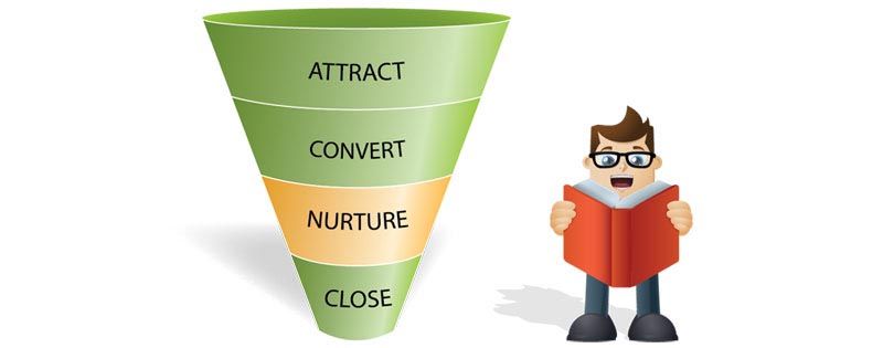
Basically, your marketing funnel is the process by which your would-be customers move from first knowledge of your brand to post-sale evangelism.

An email marketing funnel is simply how you get to turn your leads into customers. It’s a plan that lets someone become aware of your business, learn about it, and make a decision on whether or not to buy. It’s all about seizing attention, filtering, and further isolating customers with who you should be spending most of your time. It’s the key to your successful online business – or any business, for that matter.

Nurturing Leads via Email Marketing Funnel

Email marketing funnel involves categorizing your potential leads into three stages of purchase cycle: learners, shoppers, and buyers. By segmenting your email funnel into these three stages, you can ensure that you’re sending timely and relevant emails to your customers. Each of this stage calls for a unique strategy and message.

You have to ensure that your emails aren’t flagged as spam but help you build consistent relationship that brings the lead back as a customer. The email campaigns will need to roll out mails in regards to new offers in the line, discount coupons, special deals, engaging content and customized services. If this is done in a strategic way, your prospect leads stay aware of your brand and get to connect with it in a significant manner.

Let’s here understand the basic strategies as involved in nurturing a lead via email marketing funnel.

It all begins with Learning

Before selling products to customers, it’s vital to inform them on precisely what it is, your product category and what your product can do. At the learning stage, the mails must be targeted at providing quality informational content with no sales message. Many people make use of eBooks and other content products as the clasp to get leads sign up for their email funnel – and this stage is about delivering all promises and educating the consumer!

It’s time for Shopping

Once the customer is made aware of your product or service, next thing that calls for is making the lead make a choice of purchase. This is the shopping stage wherein customers review their options for making a purchase. Here leads need to be provided comparison charts for various products and services as offered along with your competitors’ products.

Making the buy

When your customers are ready to purchase, they can be moved into this stage. By sending out promotional deals, coupons; and other engaging stuff, you convince customers to make the final choice. Their choice gets clear by now as they know your brand, your product as well the difference in services as offered by you and your competitor. And if some customers don’t convert from your buying funnel, it means they aren’t looking to purchase yet. Just keep them for future reference.

Broken sales and lead nurturing processes can lead to loss of even the high quality leads. Marketers that nurture prospect leads via email marketing funnel, prevent prospects from spilling before they actually get to speak with a sales representative.

If you have your marketing funnel placed right, you will be far away from losing on any potential lead. For more details, just book for our free Marketing Funnel Strategy Session and take the much needed step towards increasing your sales!

Don’t Make These 3 Mistakes That Cause People to Unfollow You on Social Media

Are you sure you’re doing everything right on social media? Almost every business has a social media presence these days. But this doesn’t mean all are taking advantage of the countless business benefits social media can provide.

It’s true social media is the finest marketing way for making your brand reach out to a wider audience base. However, if used the wrong way, it can have a negative impact on your business. One little error can make people unfollow your brand. But how can you stay vigilant and ensure your business avoids the most common slip-ups? To put it simply―know what these mistakes are & keep them at bay.

Mistake 1: Too much of Self-Promotion or Boring Content

A little self-promotion is OK, especially when you’re doing it to establish yourself and your expertise. There is a line, however, that shouldn’t be crossed, as going over-board with self-promotion makes customers unfollow you. While you limit your promotion, also see to it that whatever content is going out is relevant & interesting to your audience. Boring and irrelevant content only gets tedious and very monotonous for the customer. When the content frequency is too high or if the matter is uninteresting, people opt to unfollow the particular brand or service on their Facebook or Twitter.

Mistake 2: Overuse of Automated Messaging or Lack of Personal Engagement

Automated messaging helps your business stay productive, focused, as well as engaged with your base of customers. But things can go haywire if the same fails―resulting in people unfollowing your brand on social media. If there is a lack of personal engagement and automated messages end up sounding extraneous, customers eventually shift their focus from your brand & stop engaging. People want an interactive platform & an automated, unresponsive social page sometimes just doesn’t cut it.

Mistake 3: Inappropriate Use of Hashtag

Hashtags are no more limited to Twitter as they have now made a strong presence on all major social media platforms as Facebook, Google+, and Instagram. However, the use of hashtags is an art – we see too many pages placing them anywhere & everywhere! A tweet with a hashtag is said to get more engagement as compared to the ones without it, but poor use of them usually causes followers a teensy bit of social frustration. And when we say poor use, we mean anything from using too many hashtags or using a hashtag that makes no sense at all.

There are a myriad of ways that things can go wrong in social media – however, starting with these super common mistakes is a good start to making sure you aren’t doing things that tend to cause unfollows.

For more tips and latest updates on digital marketing strategies, subscribe to our newsletter!

4 Ecommerce Design Trends to Increase Your Website Conversions

If you are running an ecommerce business, you already know that your website is your most important tool. Apart from reflecting who you are,  the design of  your website can speak volumes on your businesses credibility.

When we talk of an effective and result driven ecommerce website design, user flow and user navigation play important roles. Your ecommerce website is the online shop that customers visit to make a purchase, and how easily each shopper can find what they are looking for determines how often a successful transaction happens.  An ingenious ecommerce website design can help your business ROI go higher, and can help skyrocket conversions when done right.

How Does a Good Website Design Boost Conversions?

As stated, the usability of your ecommerce website goes hand in hand with conversions. Things like making your customer support and contact details front and center, and keeping the forms as easy and clean as possible are all significant ways to turn that visitor into a loyal customer.

Why do things like these matter? It all goes hand in hand with credibility & trust to buy from the website. For example, having visible customer support & contact details helps diminish a visitors hesitation to buy from a website they have stumbled upon for the first time.

Keeping this in mind, the user experience on your website plays a crucial role in converting probable leads.

So How Do You Start With Designing an Ecommerce Website That Wow’s?

Flat Design: The bigwigs in the web world; Google, Microsoft and Apple have clearly stated that flat design is here to stay. Flat design works wonders for ecommerce sites as its pleasing, easy to understand, and uncomplicated to expand and make responsive. It’s directed towards focusing on the content, which works in cutting down the bounce rate as people find what they are looking for easily.

Micro UX/Transitions: Your primary objective is to make the ecommerce experience a delightful one for your customers. You may assume that a customer is sure to overlook the fun little features but in fact this boosts the user experience and even increases click-through rates. Making micro UX effects and transitions a part of your website’s great design is sure to enhance the user experience and create a brilliant impact.

Tiled Navigation: Images make a more positive impact than text boxes, and this is the reason tiled navigation is mounting on popularity. When you use image tiles in place of lists, it cuts down the odds of getting lost and gives customers a preview of what they will be seeing. It has the potential to seize a visitors attention as soon as they enter your website, and keep them engaged through appealing visuals.

Device Agnostic: An ecommerce site should appear and function accurately on all screen sizes. This is where device agnostic comes into fore. Your ecommerce design must consider the quantity of screen resolution combinations, input techniques, browser capabilities, as well as the connection speed to build the most pleasurable user experience. Device-agnostic design assures that every visitor receives the same experience upon entering your store, irrespective of what method they use to get there.

Wondering if your website is sales-ready? Book a free website analysis with one of our lead generation experts & get a detailed consultation to determine if your online property is set up to convert visitors into customers. 

Book a 1 hour free website analysis here

How To Use Visual Content the Right Way on Social Media

Did you know that followers on social media are 44% more likely to engage with your content if it contains pictures? Visual content can be one of the most powerful tools in your brands social media arsenal.

So how do you make sure you’re using your visual content effectively?

Optimise your images

Every social media platform has different dimensions for image uploads, which means every image you share needs to be optimised specifically for various platforms. This ensures that it looks good and relevant details don’t get cut off. Nobody is going to be impressed with content that clearly hasn’t been optimised for their timeline. For a cheat sheet on image sizes across different social platforms, click here.

Maintain a specific design scheme

When creating visual content to share on social media, it’s important to have a set design scheme that you follow, usually in line with your brand colors. We recommend spending some time creating design templates that you can easily update with content: for example, a template for an image with a horizontal banner of text. Make sure to keep what you post on social media consistent by sticking to a colour palette, so that it is immediately identifiable with your brand.

Use the power of quote graphics

Social media is flooded with quote graphics, and for good reason – people love a personal touch that helps them connect with you and your brand. It allows them to form a unique relationship with the identity of your brand, rather than just the product you sell. And it is exactly this relationship that creates consumer loyalty. Plus, people enjoy sharing & tagging such images with friends, making it a great way to boost user engagement.

Pop in some photographs

Scrolling across a page with just designed graphics can get pretty boring and monotonous. Break the rut by sharing photographs instead of graphically designed visual content once in a while. Not only does this capture more attention, it gives a human element to your brand. While this doesn’t necessarily mean sharing group photo’s of the team every day, it can be used to perhaps photograph the new orders that have just been prepared for shipping.. The possibilities are endless! Your audience starts seeing your brand as a group of working individuals, rather than a faceless corporation.

Visual content has slowly and surely become the king of social media sharing, so make sure your marketing plans reflect the importance of images.

Psst.. We’re going to be having an intensive Facebook Workshop on May 25th – Make sure you subscribe to our newsletter to receive the official invitation!

Are You Using Your Facebook’s Call To Action Feature?

The Call To Action feature on Facebook can now bring in traffic!

Now, its become easier to lead and drive people to your landing page. Its become as easy as simply adding a call-to-action button on your Facebook page.

We all use call-to-action feature in our ads, but did you know that you can now include this feature into your Facebook page?  So, even if  customers have missed out on a particular ad with the call-to-action, they always have it available to them when they land on your Facebook page. Being situated just below the cover picture, the call-to-action button cannot be missed.

Why should you make the most out of this feature?

Links Your Website

The photo, text box and call-to-action button will lead all consumers and customers to your website. Now there won’t be any chance of missing out on any untapped customer that visits your page.

Specific Buttons To Suit Your Business

Facebook has also released five new kinds of buttons that you can have on your business page. ‘Book Now’, ‘Shop Now’, ‘Sign Up’, ‘Contact Us’, ‘Use App’, ‘Play Game’, and ‘Watch Video’. Depending on the nature of your business, select from these seven, and never miss out on any interaction with your audience.

Increase Your Conversion Rates

During the three week test, it was recorded that the call-to-action button delivered up to 2.5x of conversion rates, compared to other social placements. So how does this actually happen? Without a call-to-action button, a visitor would come to your page, browse and leave. However, now with this call-to-action feature, once they visit your page, they are directed and instructed to take action by the button.

Call-to-actions have been a common concept when creating ads, but we’ve seen substantial evidence that their placement on your actual page can be beneficial as well. From all the potential customers that visit your Facebook page, only a certain amount land there through your Facebook ads (which have the Call-to-action button) –  people who arrive there through other sources, have not been directed to take the action that you want them to. Which is precisely why the addition of this feature allows higher conversions from every customer that visits your Facebook page no matter how they landed there.

Want to learn more about Facebook marketing?
Subscribe to our newsletter to receive updates on our bi-monthly training workshops!

Top 5 Mistakes Small Businesses Make When Managing Their Facebook Page

Do you know there could be a mistake right now on your Facebook Page?!

We all make mistakes, however in business online, making mistakes could result in crucial outcomes we might not be able to afford.

Mistakes on an important medium like Facebook, which helps you connect with your audience, can lead to drastic circumstances. You could not only lose your existing customers, but could also repel potential consumers that could have turned into loyal customers.

So what are these mistakes?

Posting Irrelevant Content

It is very important to put up posts on your page that go hand in hand with your line of business. For e.g., Do not put up pictures of cute cats and dogs when your business is about dealing with cars. You could confuse your own audience with irrelevant information and posts. Not only will they never revisit your page but your page would not sound like serious business anymore.

Stick to your industry and products or services. It’s ok to add a little “something different” now and then, to spice up your page, but not on a frequent basis.

Spamming Your Fans

When you post too much on your page, your fans’ newsfeed clogs up with your content. This can annoy your fans after sometime, because all they see are your posts on their newsfeed, leading them to click the unlike button, or simply ignoring you.

Make sure you don’t post too much on your wall. Post only things that are important for your audience to know. Keep in mind that the quality of your posts is more important than quantity. Quality attracts, while too much quantity repels.

Deleting The URL Address

More often than not, when admins post images, articles or videos, they forget to delete the URL address, which adds too many lines, making posts look tacky and messy.

Make your wall looks as simple, and clean as you can. After uploading the article or video, remember to delete the URL address for an aesthetic appeal.

Ignorance Towards Fans

About 70% of questions asked by fans on Facebook pages remain unanswered. This really puts off and disappoints your audience. When fans show an initiative in the form of queries or questions that go without replies, they feel ignored. Ignoring fans is one of the biggest mistakes you can make on social media. This will reduce your fan base in the long run.

Take some time out everyday to answer and acknowledge your fans by replying to their doubts and questions. Here’s to building stronger relations with your audience!

Synchronising Your Corporate Culture With Your Facebook Page

Make sure that your Facebook page reflects your corporate culture. Your Facebook page should go hand in hand with your business goals and visions. The page is a part of you, therefore, it must portray the same personality as your business. The page can be a little informal and casual but not too much, as you don’t want your fans to feel that you are not serious.

Therefore, maintain your identity and hold your ground even while interacting with your fans.

Have you been guilty of any of these mistakes? Make sure to amend them and take your Facebook game to the next level.

Looking to increase your customer engagement? Find out more by visiting our blog  on “How to Target Your Facebook Posts To Increase Engagement”.

Want to learn more about Facebook marketing?
Attend our workshop on 13th April, 2015 where we talk about the best methods to get more conversions with your ad spend on Facebook.

Register for the event here

Let's Talk

Let’s Talk